Gallery Avenue
You have created a beautiful collection of artworks, wanting to share them with the world, but the thought of contacting galleries individually makes you sigh with fatigue? Gallery Avenue is here to serve as the shortcut!
Submit an exhibition proposal via our platform and we will connect you to the best galleries in your city.

Project Overview
The problem:
Artists find that contacting art galleries to be very time consuming, and most galleries do not have online submission platforms.
The product:
Gallery Avenue's website provides artists a platform to submit proposals online that will reach multiple art galleries in their city.

My role:
UX designer leading the app and responsive website design from conception to delivery.
Project duration
2 weeks.
Responsibilities:
Conducting interviews, usability studies, paper and digital wireframing, low and high-fidelity prototyping, accounting for accessibility, iterating on designs, determining responsive design.
The goal:
Design a submission flow that is easy to navigate.
Understanding the User
I conducted user interviews to better understand the target users and their needs. I discovered that many users (artists) have full-time jobs and create art as a hobby. They need a method to submit art proposals efficiently.
However, contacting different galleries is a time-consuming task itself, and most galleries do not provide online submission forms. The artists would need to send an email including the exact information that are required from the gallery. Their proposal will be disqualified if any information is missing, which results wasted time and effort.
Persona

User journey map
I created a user journey map to help identify possible pain points and improvement opportunities.

Starting the Design
Storyboards
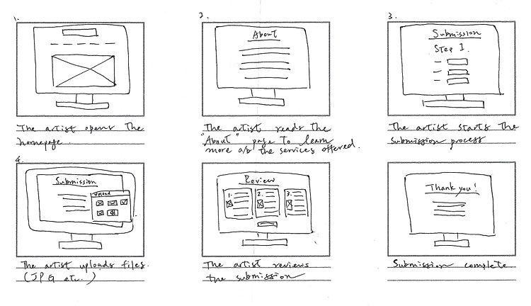
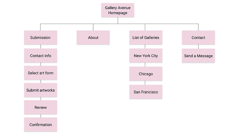
Sketching out storyboards helped me build a smooth submission flow. From there, I was able to easily develop the sitemap and decide which pages to prioritize in the menu bar.

Sitemap

Paper wireframes
I sketched out paper wireframes for each webpage keeping the user pain points in mind.

Digital wireframes
Moving from paper to digital wireframes made it easy to organize and plan the layout. I divided the submission process into three steps, which makes the experience less overwhelming. This also prevents any required information from being overlooked.
View Gallery Avenue low-fidelity prototype

Usability study findings
The low-fidelity prototype was tested with 5 participants in an unmoderated usability study.
I chose to conduct unmoderated usability study because the method is similar to real-life situations where people browse websites on the internet and explore the site without assistance. I wanted to know the way how artists navigate Gallery Avenue intuitively, and what features could be made smoother in order for them to have an efficient submission experience.
Here are the main findings uncovered by the usability study:
1. Progression bar
It would be helpful to let the users know ahead of time how many steps are needed to complete a submission flow
2. Return to previous page
Users would like a button that will allow them to return to the previous page during each step
3. Who will be receiving the submission?
Users want to know which galleries will be receiving their submission.
4. Save and edit
Users wanted an option that allows them to save the submission for editing later.
Refining the Designs
Mockups
I made changes to improve the site’s submission flow based on the insights from the usability study.


Screen size variations
I included considerations for additional screen sizes in my mockups. Since mobile accounts for approximately half of web traffic worldwide, I felt it was important to optimize the browsing experience for the device.

Style Sheet
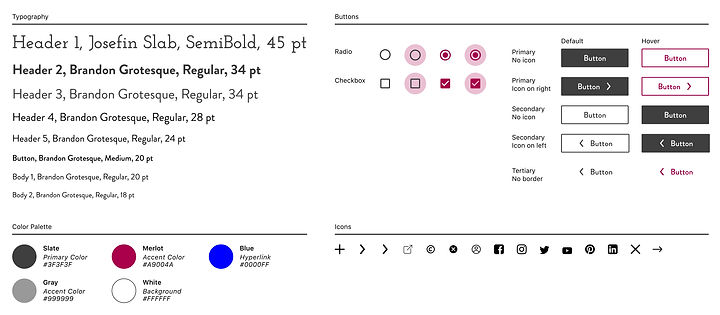
I kept the color palette to a minimum to create a clean appearance. I chose Slate as the Primary color, it's easy to read and less harsh than black on white.

Accessibility considerations
1. Headings
I used headings with different sized texts for hierarchy.
2. WebAIM
All colors pass WebAIM standards.
Validation
I conducted validation testing of the desktop prototype with 5 participants. Below is a summary of the findings:
5/5 Find the website easy to use and clear to navigate
5/5 Find the submission process easy to follow
4/5 Would use the website or recommend it to friends
One of the participants shared:
"It's ideal for modern day people who have very little time. I would also like to see it developed into an app."
What I Learned
The feedback collected from the usability studies helped me understand the emotions users go through. I learnt that participants felt uneasy if they couldn't edit their submissions. Knowing they can return to previous steps make them feel a lot more comfortable using the service.
This was the second assignment from Google UX Design Certificate. I was still fresh and learning a lot about this field (and will forever be learning). I kept the design of Gallery Avenue minimalistic. Firstly, I didn't want any frills to distract the submission flow. Secondly, while researching many famous art musuem/gallery websites, I noticed their layout were very clean, I wanted to emulate the style. Later on I learned the saying "the UI should be invisible", and by then I could understand fully why minimalism is favored in the industry.
